Vismon is designed to help a decision maker look at trade-offs among different indicators in a fishery system. We have provided some scenarios, from very simple to complex in order to demonstrate some of the features of Vismon. The example below is only for the purpose of demonstrating the software, not a recommendation of actual policy choices.
This particular example is for the Yukon River fall chum salmon in Alaska (download the data file).
Content
About the data
The F02-Yukon_499AllMonteCarloTrials.out data file contains the simulation input (management option) and output (indicator) values. In addition, it has some metadata about each management option and indicator.
In this example, the two management controls available to you are target escapement in thousands of spawners (called "Escapement target") and proportion of returns above that target that are harvested (called "Harvest rate"). In the latter case, if the target escapement is, for instance, 500,000 fish, then a harvest rate value of 0.6 would mean that 60% of the returning adults that exceed that 500,000 are intended to be harvested. There is outcome uncertainty in this model, so that is why the harvest rate is what is intended. If the simulated actual return comes in below the escapement target, then no commercial fishing is allowed.
Indicators of outcomes cover three categories: escapement, subsistence catch (which is taken upstream), and commercial catch (which is taken downriver from subsistence catch and in the ocean). For each of these three categories there are four indicators: average values across the 500 Monte Carlo trials, median of the values, average temporal coefficient of variation over the 100-year simulations, and a percentage indicator specific to each category. We show (1) percentage of the years in which the realized escapement is below the target (after taking outcome uncertainty into account), (2) percentage of years in which subsistence catch is below a threshold deemed to be a concern (the lowest quartile of historically occurring subsistence catches), and (3) percentage of years when the commercial fishery is closed down.
Note that catches are in thousands.
Loading the file
Choose , and open the file "F02-Yukon_499AllMonteCarloTrials.out" (download). It may take awhile for the tool to fully load the input file, depending on the hardware configuration of your system.
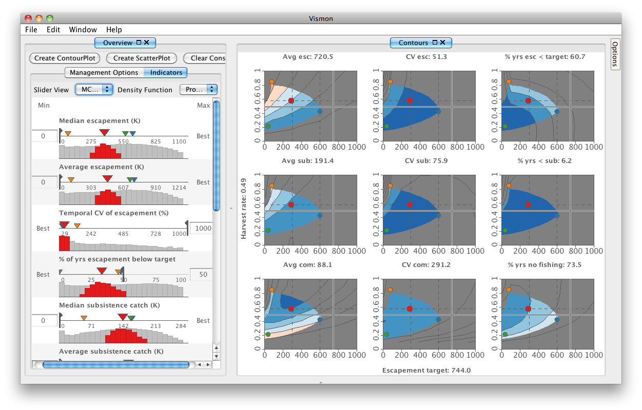
The Overview pane, on the left, summerizes the management options and indicators in separate tabs. Each management option has two textfields and one dualslider to enter the minimum and maximum unacceptable values. However, each indicator has one textfield and one slider for entering either minimum or maximum unacceptable value depending on whether higher or lower values of the indicator are preferable. The optimality of each indicator is specified as metadata in the input file.
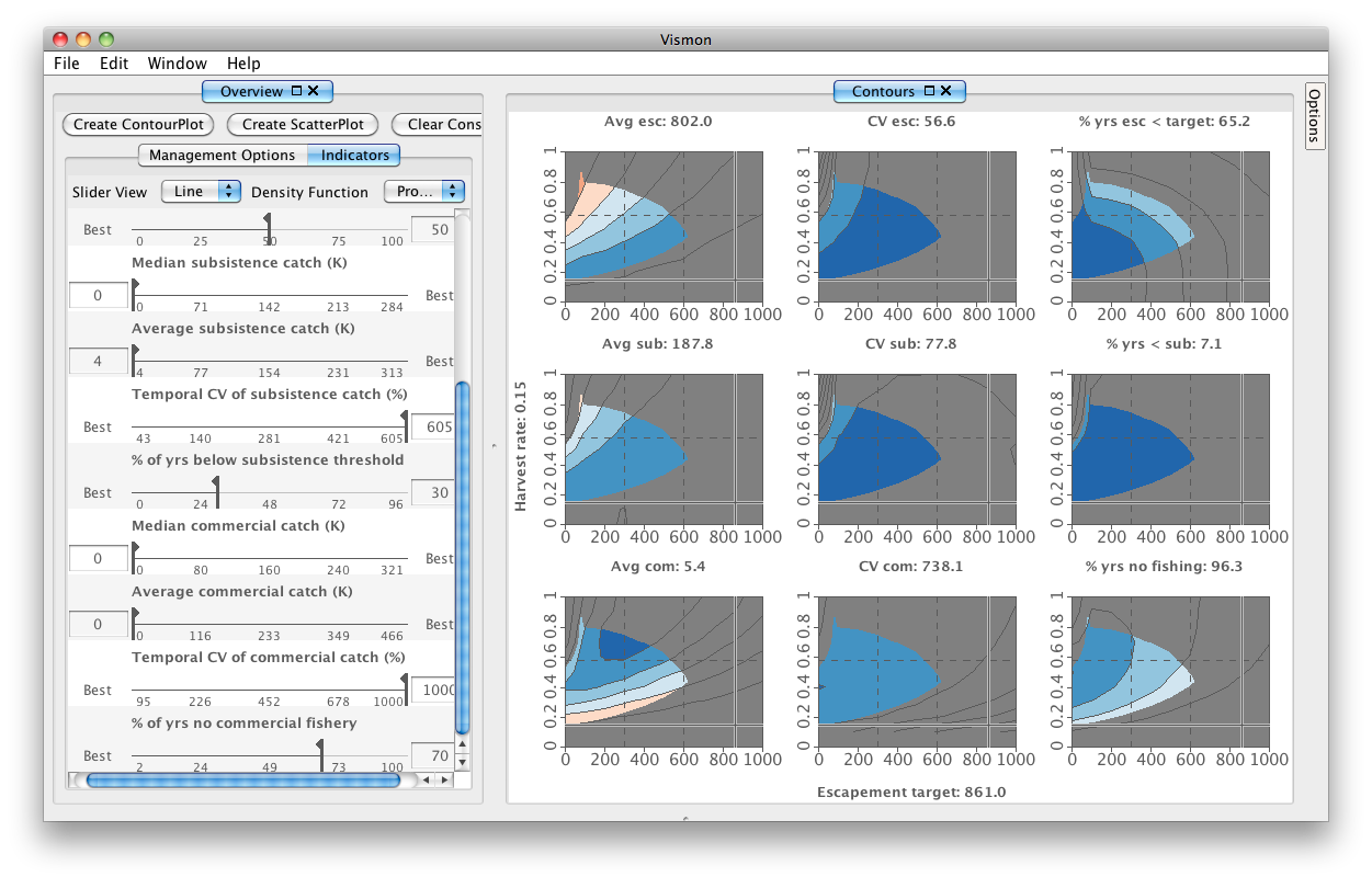
In the Indicator tab, the "Slider View" drop-down menu controls the level of detail of information shown about the indicators. In addition to showing each slider as a simple line, histograms can provide more information about the distributions across the underlying Monte Carlo trials. The "Density Function" drop-down menu controls the visual representation of histograms, as either direct or cumulative probabilities. For the first steps in the tutorial we leave the default settings of Line for Slider View and Probability for Density Function, and return to explore different settings for these options in Steps 16 and 17 below.
|
Slider View: Probabilistic Objectives; Density Function: Probability
|
Slider View: MC Trial; Density Function: Cumulative
|
|
|
A simple case: using a single plot of one indicator
Goal: This section will show you how to use Vismon to visualize indicators' values, tag special values of management options, use cross-hairs, and add limits to the values of indicators.
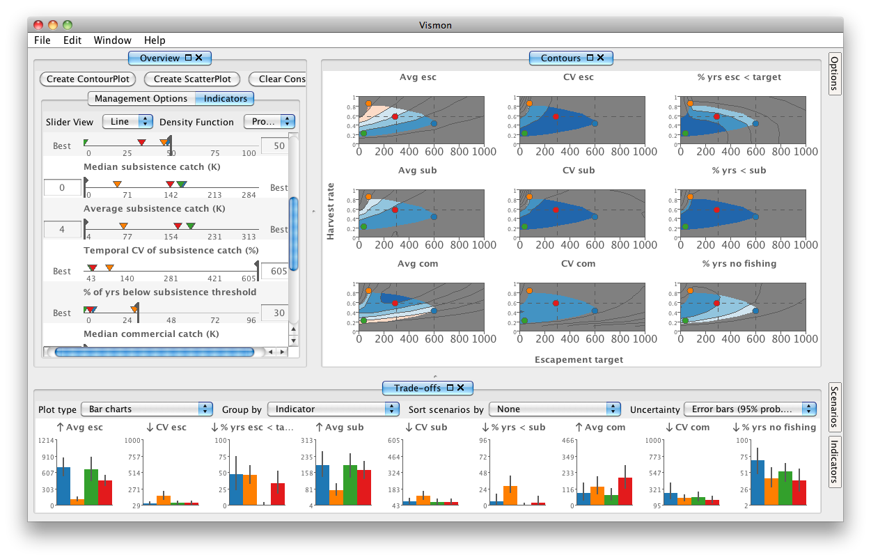
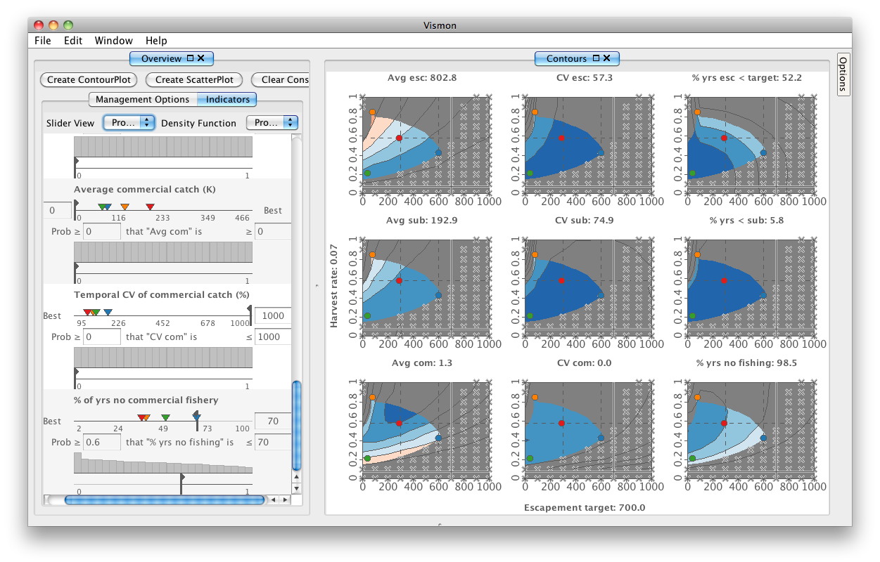
When you open the data file, the contour plots of all indicators over the management options are created.
|
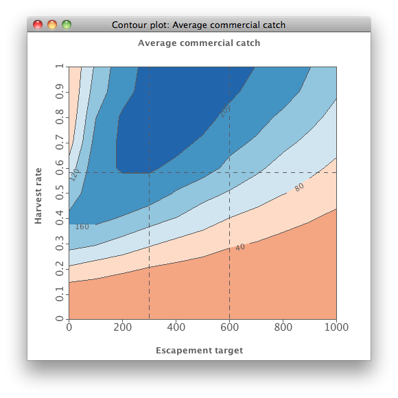
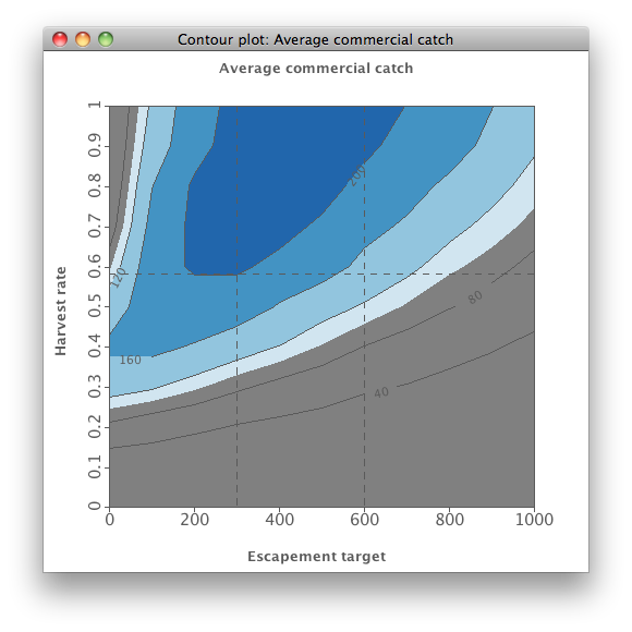
Step 1. Just to get a feel for the program, focus on a single contour plot first. Look at the isopleth diagram of "Average commercial catch" that summarizes results from the 121 scenarios that were simulated. Each of the X and Y axes is based on 11 discret management controls which were the input to the simulation code. The X axis is "Escapement target" in thousands of spawners, and the Y axis is the "Harvest rate", or proportion of returning fish (returns) above that target that are harvested.
The contour plot is colored by default to make the most desirable catches more readily distinguishable from the less desirable catches. The most desirable area is colored the darkest blue.
|
|

|
|
Step 2. Show historical escapement goal ranges and historical Harvest rate by choosing , and adding two Escapement goal values at 300 and 600, and a Harvest rate value of 0.583.
|
|
|
|
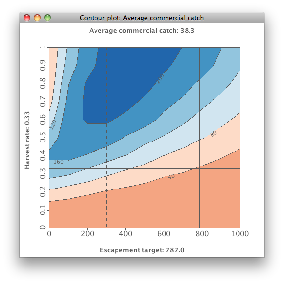
Step 3. When you hold the cursor over the contour plot, it will dynamically show all three values at a given point: the Escapement target and Harvest rate and the value at that point. Here the value is the "Average commercial catch". This feature is called 'cross-hairs'.
|
|
|
|
Step 4. You can also apply constraint regions to reflect unacceptable values of an indicator. Go to the main window of Vismon, and look at the Overview pane on the left that summarizes the data with the sliders and "Min" and "Max" textfields. For indicator "Average Commercial Catch", put in a value of 100 for the minimum. A grey area now blanks out the unacceptable region, or the combination of Target escapements and Harvest rates that are not feasible, given that constraint. You can also grab and drag the vertical line in the slider of "Average Commercial Catch" to dynamically change that unacceptable region. The remaining brightly colored region is the only acceptable area for choosing management actions.
|
|
|
|
Step 1
|
Step 2
|
Step 3
|
Step 4
|
|
|
|
|
|
|
|
A more complex case: trade-offs using multiple plots of indicators
Goal: This section will show you how to use Vismon to investigate trade-offs among different indicators that are implied by choosing particular management actions ("Escapement target" and "Harvest rate"). This software enables you to choose any number of indicators to explore among the 12 produced by the simulations.
|
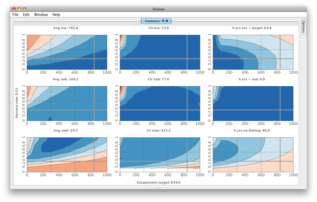
Step 5. We need to remove all costraints before continuing the tutorial. To do so, press the Clear Constraints button on top of the Overview pane. You can see the effect of changing the constraint regions on the contour plots.
|
|
|
|
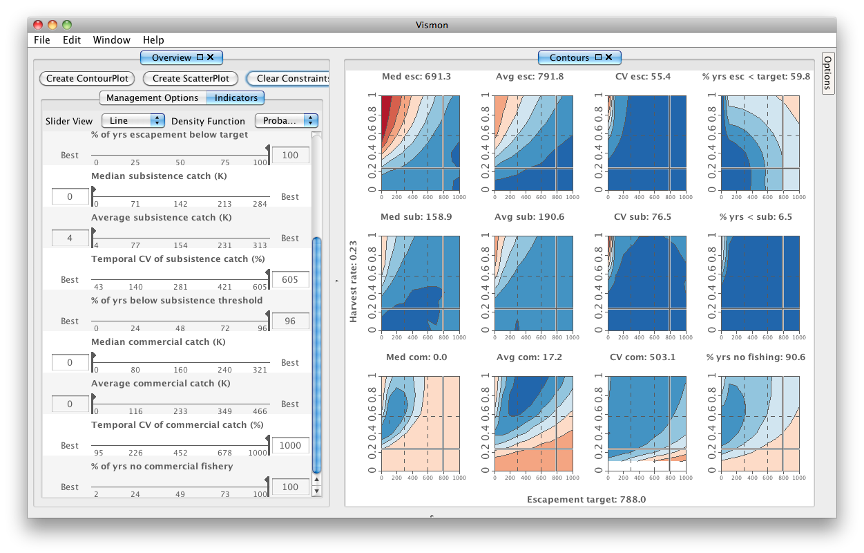
Step 6. Now look at contour plots of multiple indicators to directly view trade-offs among indicators for a wide variety of management options. For the purposes of this demo, we remove the contour plots of medians, that is, Median escapement (or Med esc), Median subsistence catch (or Med sub), and Median commercial catch (or Med com). To remove a contour plot, right click on it and press .
Click on the Options tab on the top-right of this pane, and note that the spectrum of colors is defined from most to least preferred. Close the Overview pane, and take a close look at the plots to make sure that you understand what each is showing you.
|
|
|
|
Step 7. Go to to open the Overview pane. Put in some constraint regions now to simplify the visual complexity that you will be working with when choosing management options. Those constraints can always be changed later in sensitivity analyses.
We suggest that you start with setting the maximum acceptable values of three indicators by typing numbers into the corresponding maximum box in the frame to the left. Try these values:
- Maximum "% of years with escapement below target" = 50
- Maximum "% of years below subsistence catch threshold" = 30 (notice how little change is made when this value is put in.)
- Maximum "% of years with no commercial fishery" = 70
The result is a relatively small region of acceptable management actions to explore. Note that if you change one of the constraints by moving a dualslider vertical line or putting in a new number in the maximum box, the shape of the acceptable region may change. This is one good way to determine how much flexibility one can gain by slightly changing a given user group's constraint. Because of the highly nonlinear nature of the contour plots, changes in constraints of some indicators (like the maximum "% of years below the escapement target") will produce a large increase in the feasible region, whereas changes in others (like the maximum "% of years below subsistence threshold") will change that region very little. This is one key value of this software, to enable you as the decision maker to readily examine the implications of particular changes in constraints (perceived or real). Try out different constraint regions to see their effect.
|
|
|
|
Step 8. Now use cross-hairs on the contour plots. The cross-hairs let you quickly compare indicator values at the same
(X,Y) location across plots by simply moving the mouse and seeing the color at the crosshair intersection. Vismon also supports more in-depth inspection of the indicator values at any (X,Y) plot location by clicking on that point. We will call this a scenario - again, in this dataset X is target escapement and Y is harvest rate. Select four scenarios in this demo, with the first one as the baseline case:
- (600, 0.4)
- (88, 0.84)
- (41, 0.22)
- To create scenario 4, click in the "Average commercial catch" plot on the bottom left of the matrix, within the upper part of the triangle made by the first three scenario points.
Make scenario 1 by clicking on a plot when the cross-hairs are at about (600, 0.4), which should be in the feasible region if you used the constraints suggested above. Click in the top left corner of the feasible region to add scenario 2 at (88, 0.84). Do this for scenario 3, with the values (41, 0.22).
|
|
|
|
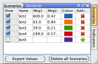
 Note: If you know the exact (X,Y) management option of a scenario, as we do, you can create one directly by clicking on the Scenarios tab on the bottom-right. The table shows the created scenarios. However, the last row is kept empty to directly enter the values of management options.
|
|
|
|
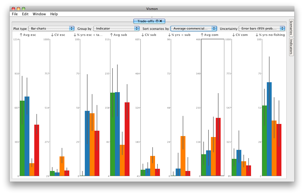
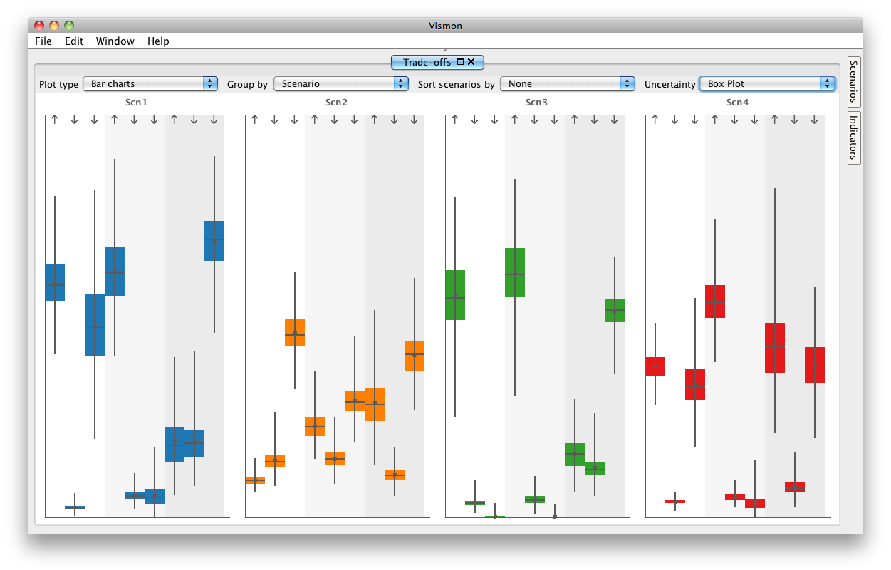
Step 9. Now look at the Trade-offs pane that has appeared. Close Overview and Contour Plot Matrix panes to better view the Trade-offs pane. Bar charts are shown of each indicator in each scenario. The bars also show 95% probability interval error bars, as well. The default ordering is just from scenario 1 (Scn1) to scenario 4 (Scn4). You can sort scenarios according to any indicator: here the most important one is "Average commercial catch". Click on the "Sort scenarios by" drop-down menu and choose that, notice that the graphs rearrange accordingly.
|
|
|
|
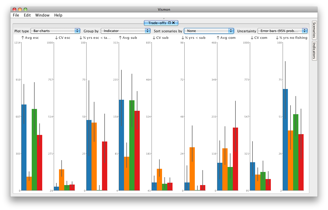
Step 10. Turn sorting by "Average commercial catch" off, by choosing the first option, which is a "None", in the "Sort scenarios by" drop-down menu, on the bottom right of this window.
|
|
|
Note: If you create a scenario that you don't want anymore, you can open the "Scenarios" tap on the right, and click on its red cross. You can delete all scenarios by clicking the "Delete All Scenarios" button.
Note: You can hide a scenario by unchecking it in the "Scenarios" tab.
|
Step 5
|
Step 6
|
Step 7
|
Step 8
|
Step 9
|
|
|
|
|
|
|
|
Step 10
|
|
|
|
|
|
|
|
|
|
|
Risk assessement: visualizing uncertainty
|
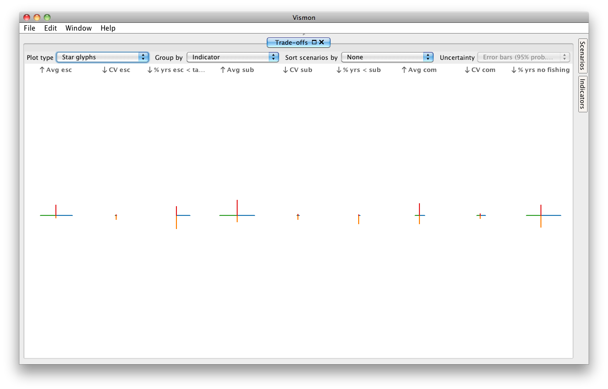
Step 11. Look at the Trade-offs pane. One way to more effectively explore tradeoffs among variables is to use other plot types at the top left of this pane. We are currently looking at bar plots. From the "Plot type" drop-down menu, choose star glyphs, which are similar to radar plots in fisheries analyses. There are nine star glyphs, one for each indicator. Each star glyph is composed of a set of arms, one for each of the 4 scenarios. Note that these are in the original raw values of the scenario regardless of which indicators you wish to maximize or minimize.
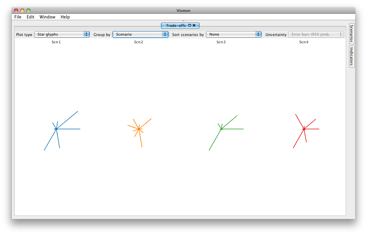
You can switch the grouping from indicator to scenario. From the "Group by" drop-down menu, choose Scenario. Now, you see four star glyphs, one for each indicator. If you move the mouse cursor over an arm, you can see which indicator the arm is related to.
|
|
|
|
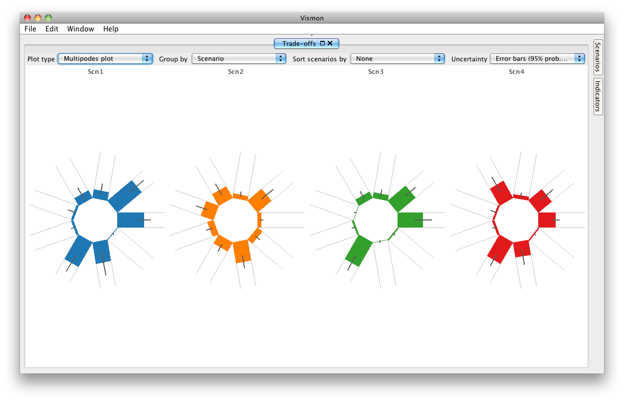
Step 12. Another view of these same multi-dimensional data is with the multipodes plot ("podes" is pronounced with a long O sound as in "20 years OLD"). Go to the "Plot type" drop-down menu, and select Multipodes plot. Here, each rectangular region reflects a different indicator, and the distance from the center of the band is the indicator's value. All features of the star-glyph views apply here too.
|
|
|
|
Step 13. In this case, the data file contains results for 500 Monte Carlo trials, so it is possible to display the uncertainty associated with the mean values shown in multipodes plots. Currently, you are looking at 95% probability interval error bars in multipodes plots. However, you can turn this uncertainty option off from the "Uncertainty" drop-down menu on the top-right. Set the uncertainty to none, and you don't see the error bars anymore.
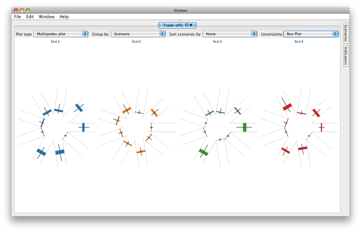
From the "Uncertainty" drop-down menu, choose Box Plot. You see the box plot associated with each scenario in each arm. Here, the colourful band shows the range between the 1st and 3rd quartiles.
Now, choose Shaded distribution from the "Uncertainty" drop-down menu. Now the data distribution for the 500 trials is visualized with greyscale shade in each band, where a darker color means more samples.
|
|


|
|
Step 14. All uncertainty visualization features apply to bar charts, too. Try different uncertainty visualizations in bar charts and notice how they change.
|
|
|
|
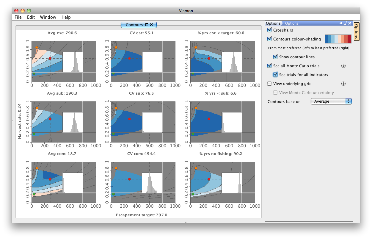
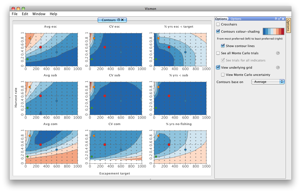
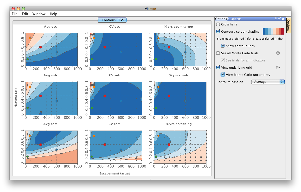
Step 15. We have seen the uncertainty associated with each scenario in the Trade-offs window. However, it is also possible to view the underlying uncertainty in the contour plots in order to avoid choosing uncertain scenarios.
Open Contour Plot Matrix pane by , and look at the Options tab. Check "See all Monte Carlo trials". Now, when you hold the mouse cursor over a contour plot, it will dynamically show the histogram of Monte Carlo trials at a given scenario. If you check "See trials for all indicators", the Monte Carlo trials of a scenario for all contour plots are displayed.
Turn off the contour historgrams whenever you finish working with it.
|
|

|
|
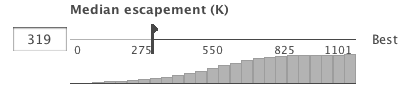
Step 16. Focusing on the Overview pane, on the slider of each indicator, there are four triangles, one for each scenario. The triangles show the value of scenarios.
Now, choose "MC Trials" from the "Slider View" drop-down menu. The histogram of indicator values is shown. Click on one of the triangles, such as the red one. The histogram changes to a Log plot, and the values for the selected scenario are shown in red, against the backdrop of the values for the full distribution shown in grey. Click on the red triangle again to deselect it.
|
|

|
|
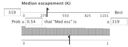
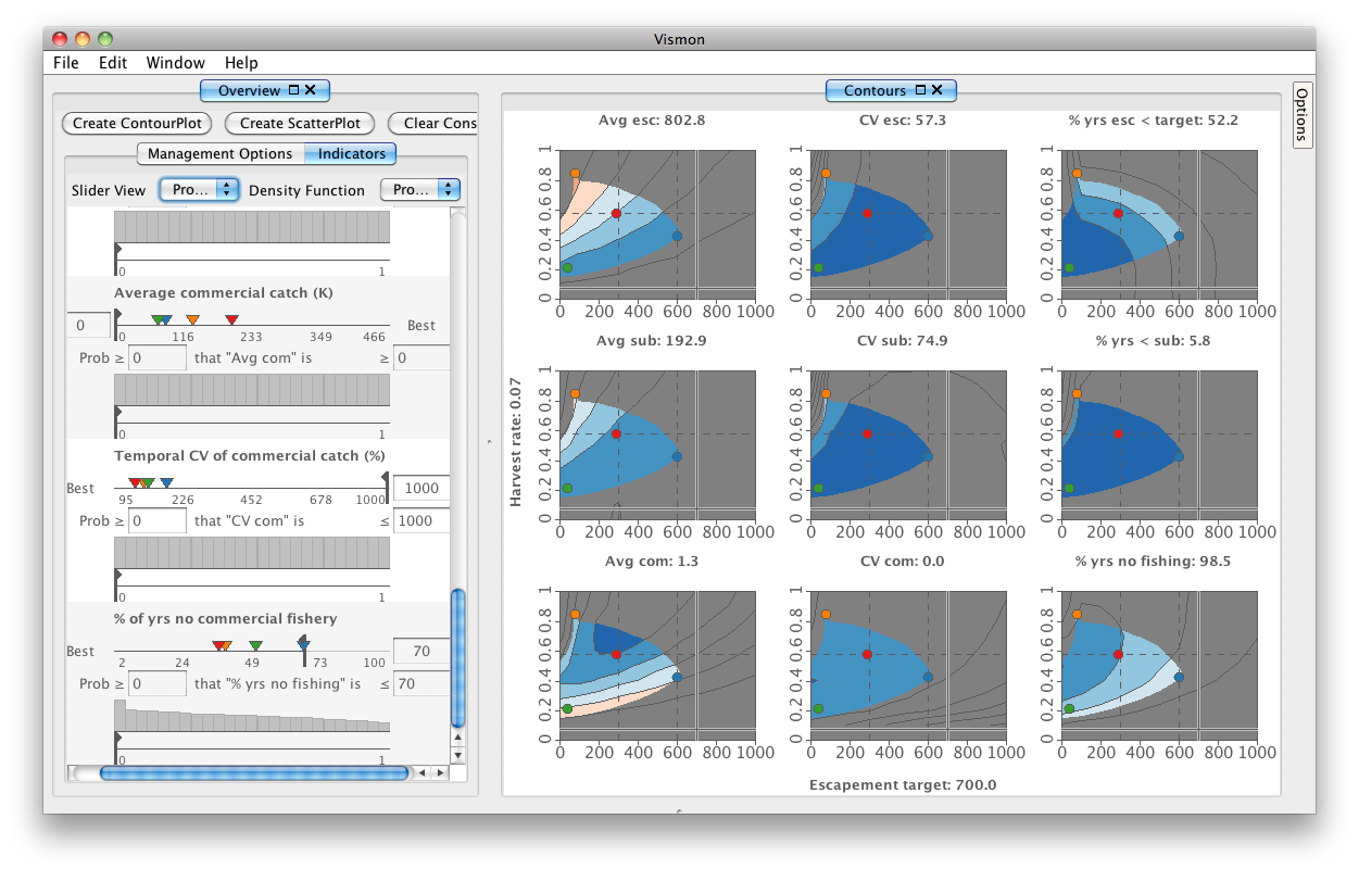
Step 17. Choose "Probabilistic Objectives" from the "Slider View" drop-down menu. Each indicator has a probabilistic inequality in the form of "Prob ≥ ▢ that "indicator" is ≤ ▢". Here, the second textfield is linked to the minimum or maximum unacceptable boundary value. In the probability textfield, the first one, you can enter how uncertain the boundary value is. All probability values are set to 0 as a default value.
The histogram informs the user, for a fixed boundary value, how many of the 121 management option combinations fulfill the inequality. As the probability gets nearer to 1, the number of combinations decreases.
The crosses on the contour plots visualize the management option combinations that do not satisfy the probability inequality. To get a feel for this functionality of Vismon, try to change one of the probability values, for example for the last indicator, i.e. "% years no commercial fishery". Change the value to 0.6. Take a close look at both the histogram, and the contour plots to make sure you understand what they mean.
Note that at probabilities close to 0.5, the crossed-out part matches closely with the greyed-out part.
|
|
|
Other features of Vismon
|
Step 18. Clear constraints, and close the Overview pane. Now open the Options tab on the right top of the Contour Plot Matrix pane. Check "View Underlying Grid" checkbox, and you see where the scenarios obtained from simulations are. If you turn on "View Monte Carlo Uncertainty", you are able to view the uncertainty associated with the girds, as well.
Turn "View Underlying Grid" off, when you are done looking at it.
|
|
|
|
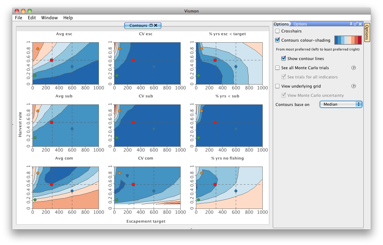
Step 19. Until now, we have looked at contour plots of averages of the 500 simulation realization. However, it is also possible to view the contour plots of medians of simulations. Change "Contours based on Averages" to "Medians", and look at the contour plots to see the difference between the old and the new ones.
|
|
|
|
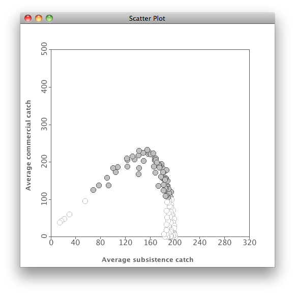
Step 20. One way to look at trade-offs among variables is with bivariate scatterplots. For instance, in the Indicator tab of the Overview pane, select "Average subsistence catch" and "Average commercial catch", and press Create Scatterplot button on top. On the resulting plot, each point is from one of the 121 scenarios that were simulated.
Note that a relatively small decrease in "Average subsistence catch" below its maximum is associated with a huge increase in "Average commercial catch". Now mouse over some desired point, such as near the top of the curve, and the management actions associated with that point will be shown dynamically in brackets (target escapement in thousands, and proportion of returns above that target that are harvested).
|
|
|
|
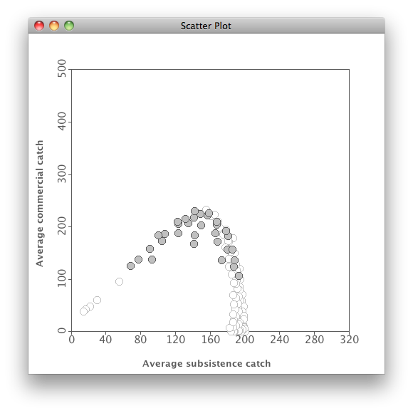
Step 21. Move the slider for "% years no commercial fishery" to 50% and note that you still get nearly the best catch possible at (300, 0.7).
|
|
|
|
Step 18
|
|
Step 19
|
Step 20
|
Step 21
|
|
|
|
|
|
|
Last changed on September 21, 2011
|
|